Wave of Flavors
Orquídea Alimentos
Art Direction

• Overview
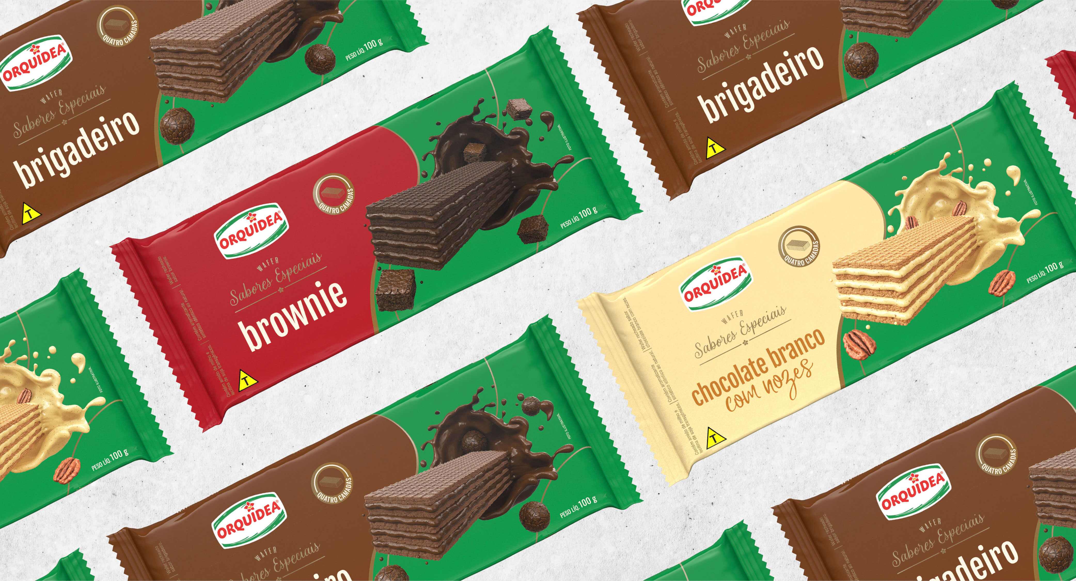
Orquídea Alimentos, a major player in the food industry, tasked us with creating innovative packaging for their new wafer line, Sabores Especiais.
The goal was to deliver a fresh, modern look that maintained the connection to their traditional product line while highlighting the exclusivity and quality of this new, exciting offering. Our mission was to strike the perfect balance between tradition and innovation, creating packaging that would stand out in the crowded snack market.
• Process
Reimagining the Wave & Distinguishing the Special Line
We gave Orquídea’s iconic wave a new, dynamic twist, allowing it to flow seamlessly around the product. This not only amplified the visual appeal but also maintained strong brand recognition. The wave now symbolized quality, movement, and indulgence, while unique design elements like gold accents and modern typography helped set the Sabores Especiais line apart from the traditional offerings.
Color Strategy for Connection and Innovation
While the familiar green remained a key anchor to the brand’s established identity, we introduced vibrant, complementary colors to highlight the distinctiveness of each flavor in the Sabores Especiais range. This infusion of color communicated the innovation behind the new line, adding a fresh, premium touch.
Consumer-Centric Layout
Bold, stylized illustrations were used to bring each flavor to life, sparking curiosity and making the product irresistible. The design was crafted to be visually striking, ensuring the wafers stood out on shelves while maintaining a cohesive look across the Orquídea range. This clear, inviting layout reinforced the quality and premium nature of the Sabores Especiais line, creating an engaging experience for the consumer.
• Outcome
The refreshed packaging successfully merged Orquídea's traditional identity with the new, premium feel of the Sabores Especiais line.
The vibrant and engaging design captured consumers’ attention, conveying a sense of quality and indulgence that elevated the product in the market. The packaging not only reflected the premium nature of the wafers but also established a strong visual link between the new and traditional offerings, driving consumer interest and brand loyalty.


