Fresh Roots: Revitalizing Direto da Serra’s Identity
Direto da Serra
Packaging

• Overview
Direto da Serra, a leading producer of organic greens and vegetables, sought to rejuvenate its brand identity to better reflect its core values of lightness, sustainability, and freshness. The goal was to breathe new life into the brand through a redesigned logo and updated product labels, ensuring the brand resonated with health-conscious consumers while staying true to its heritage.
• Process
Logo Revival
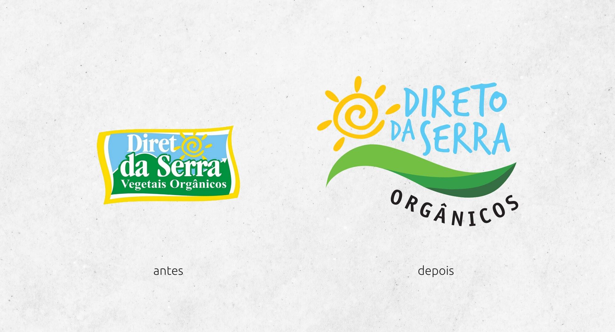
We maintained key elements of the original logo to honor the brand’s legacy, while introducing a fresh typeface for enhanced legibility and a more contemporary feel.
Label Transformation
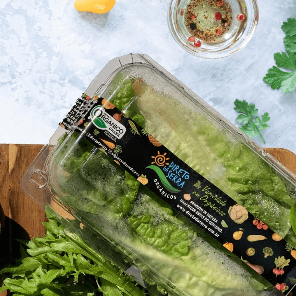
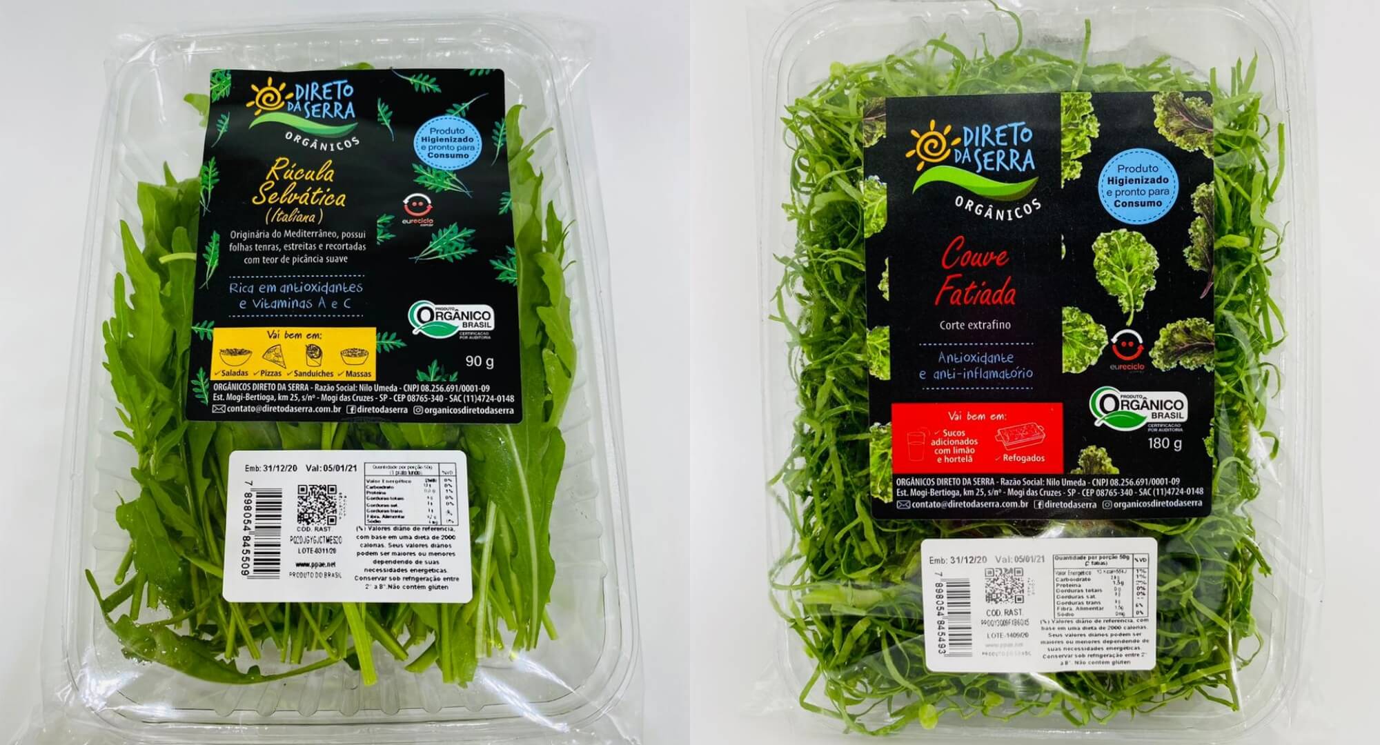
The product labels were designed as vibrant watercolor illustrations, combining bold, colorful imagery with a sleek black background to communicate the brand’s commitment to quality, sustainability, and the beauty of organic produce.
• Outcome
The revitalized logo and labels successfully captured Direto da Serra’s commitment to fresh, organic produce and sustainability.
The new visual identity helped position the brand as sophisticated yet accessible, attracting a broader audience of health-conscious consumers while celebrating the natural beauty of their farm-fresh products. The design transformation not only modernized the brand but also emphasized its organic roots in a visually compelling way.


